



Grom brand redesign
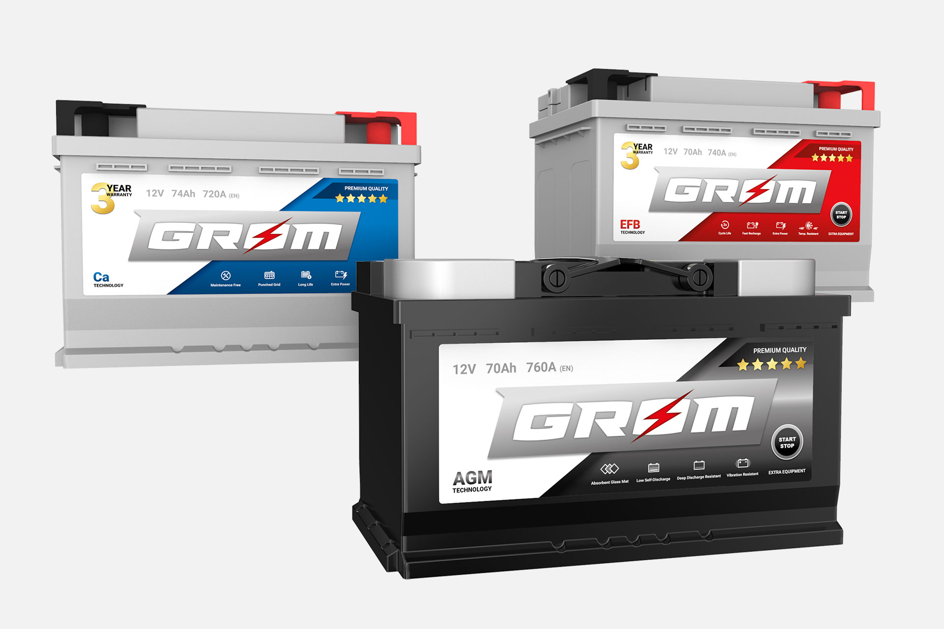
Grom batteries
Grom is a brand of car batteries that exceeds in quality all the competitors in the same price range. Previous label design was dated and incoherent stylistically.
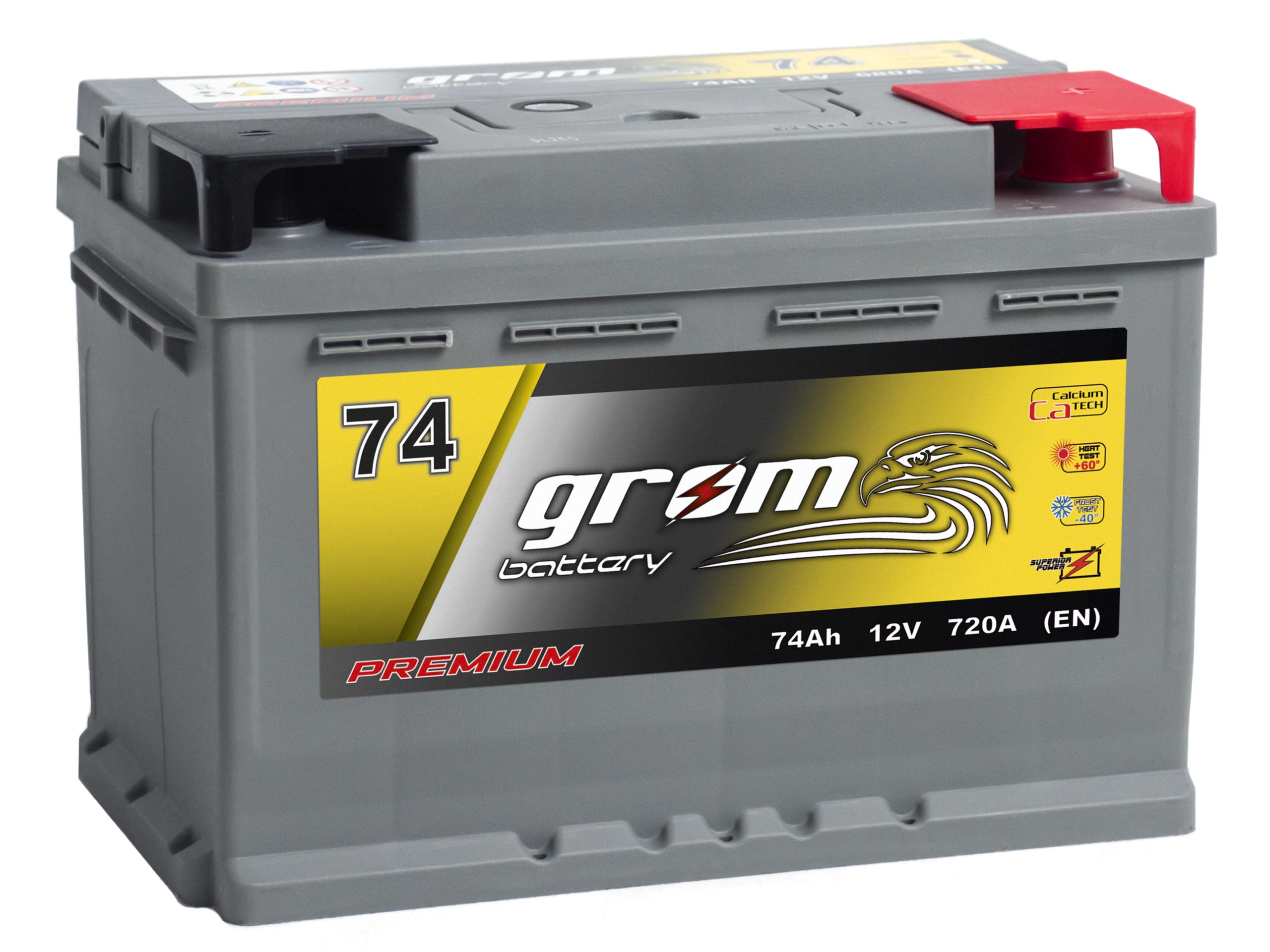
short brand brief
Concept
Grom is a promise of quality and reliability.
Grom batteries are positioned as premium and ultra-premium.
They provide more than 2 years of operation
Target group
Mostly men aged 30 – 40 years.
Common values and needs of the target group.
Knowledge of the automotive industry, constant search of best quality car parts, a passion for DIY in your car.
Promise
Grom is reliable.
Grom is of the best possible quality.
Grom of every price range is manufactured using premium grade technologies.
Symbolism and character
Grom (eng. bolt, thunder) – lightning, strength, electricity,
Eagle – symbol of Poland, symbol of strength (the result of the research showed that this symbol must be completely abandoned due to the association with the Orlen brand),
The client wanted the new design to be clearer, refreshed and closer to the flat design trend represented by leading automotive brands.
iterative design
Design decisions were based on a group study of approximately 50 employees of Specpart stores in 3 rounds. Each of the participants was to choose two proposals which they liked the most and which the least.
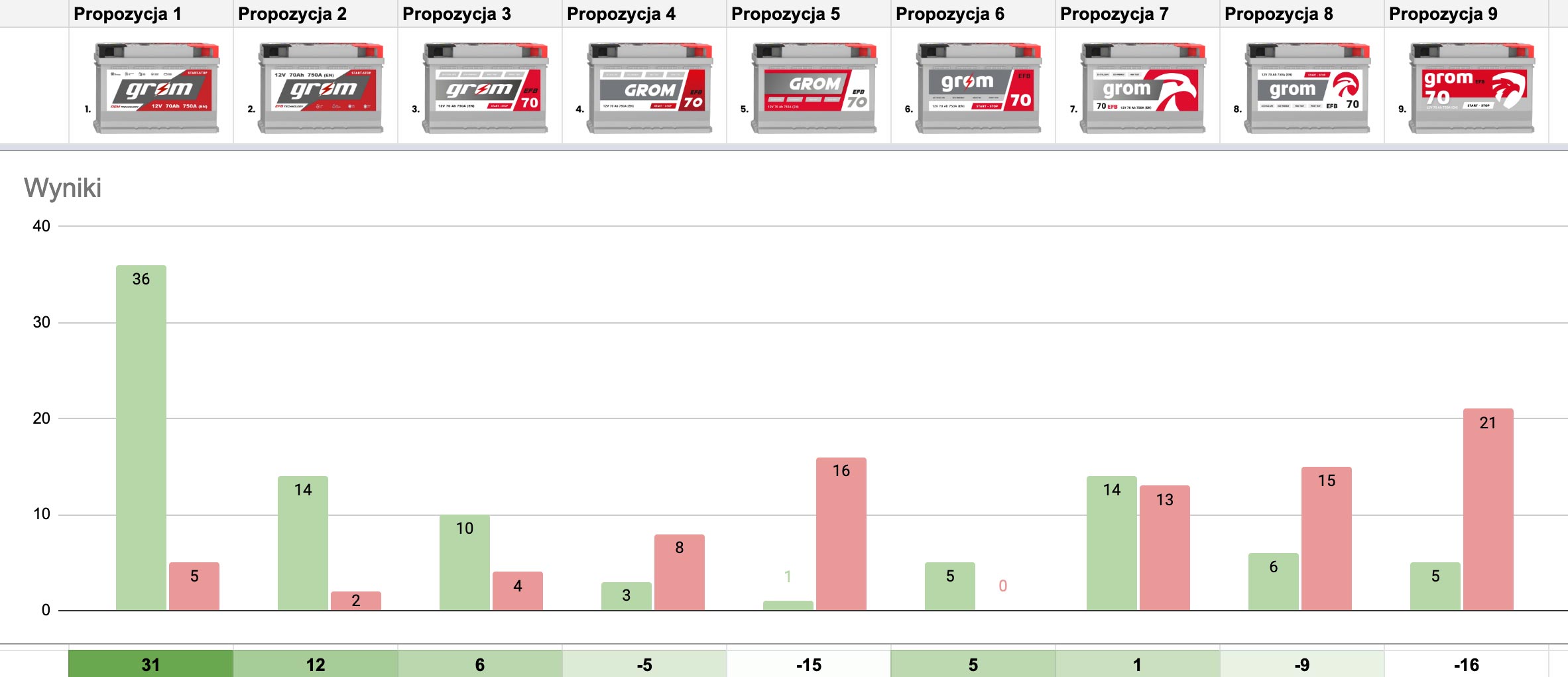
The first study aimed to establish the main character and layout of the new label. The prepared proposals were distinguished stylistically – variants with the old and new logos, more dynamic and more static propositions. Based on additional answers, I decided to eliminate the image of the eagle, which is associated with the Orlen brand. A clear winner was selected with the background divided by a slant.
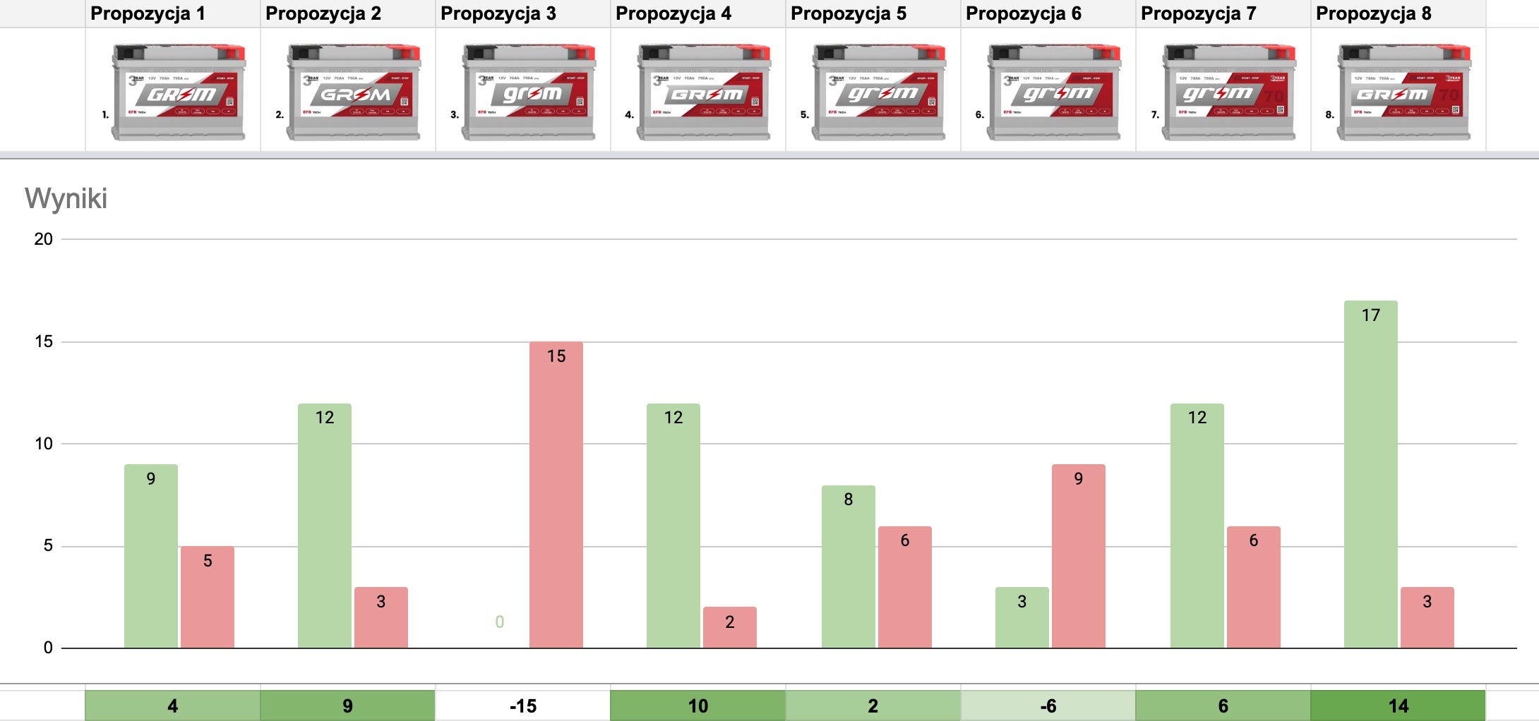
The second study was based on a development of the winner of the first round. New variants of the logo were presented, as well as two proposals with a different arrangement of the composition. Even though the proposal no. 8 had the most votes, the client decided that we are developing proposal no. 4.
The third study established colour hierarchy:
Premium – non-metallic blue as the basic product in the line, the colour of trust
EFB – non-metallic red, increased efficiency, power
AGM – metallic graphite, black, domination, resilience
Original product line colours have been changed to distinguish between the positioning of the product in the offer, and removal of the yellow colour was dictated by the difficulties in maintaining the print quality by the battery manufacturer.
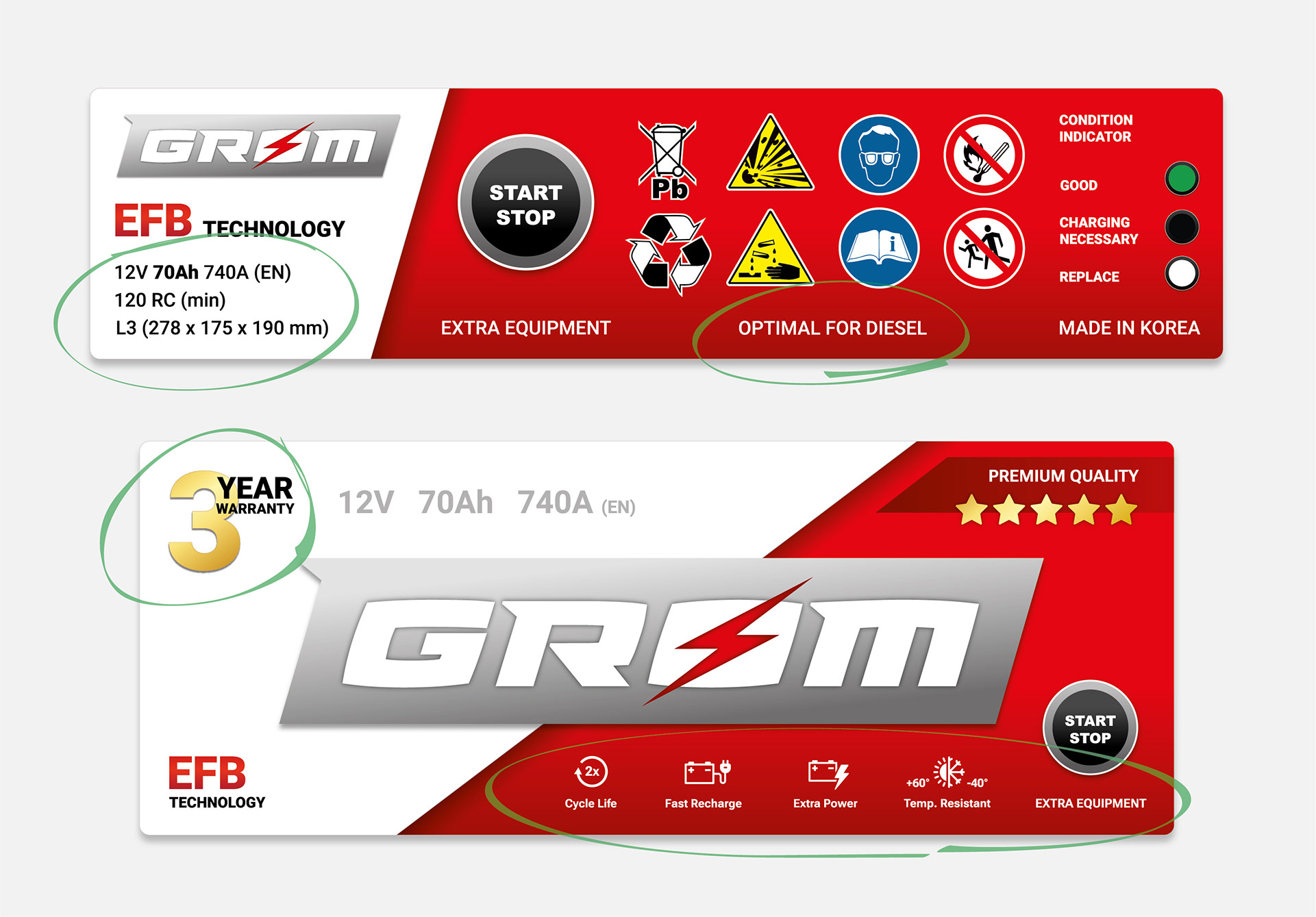
Additional study regarding information (icons + descriptions) on the labels was conducted. Research in the form of an open answer, aimed at providing information about the features of the product that are most often asked by customers or that most often convince them to buy a battery.
final design
The presented project is the result of decisions supported by research and a sense of the characteristic tastes of the automotive industry.
The design is based on simplified shapes and more contrasting colours, but is enriched with shading for two reasons:
- The first reason is purely technical – the battery manufacturer has relatively limited quality printing options and this style improves the visual perception of the label.
- The second reason is the style preferences of the automotive industry – flat design may be perceived as something too simple, uninteresting and not attractive. The proposed style is similar to the flat design, but there is a slight fondness for skeuomorphic versions of the moto brand logos.
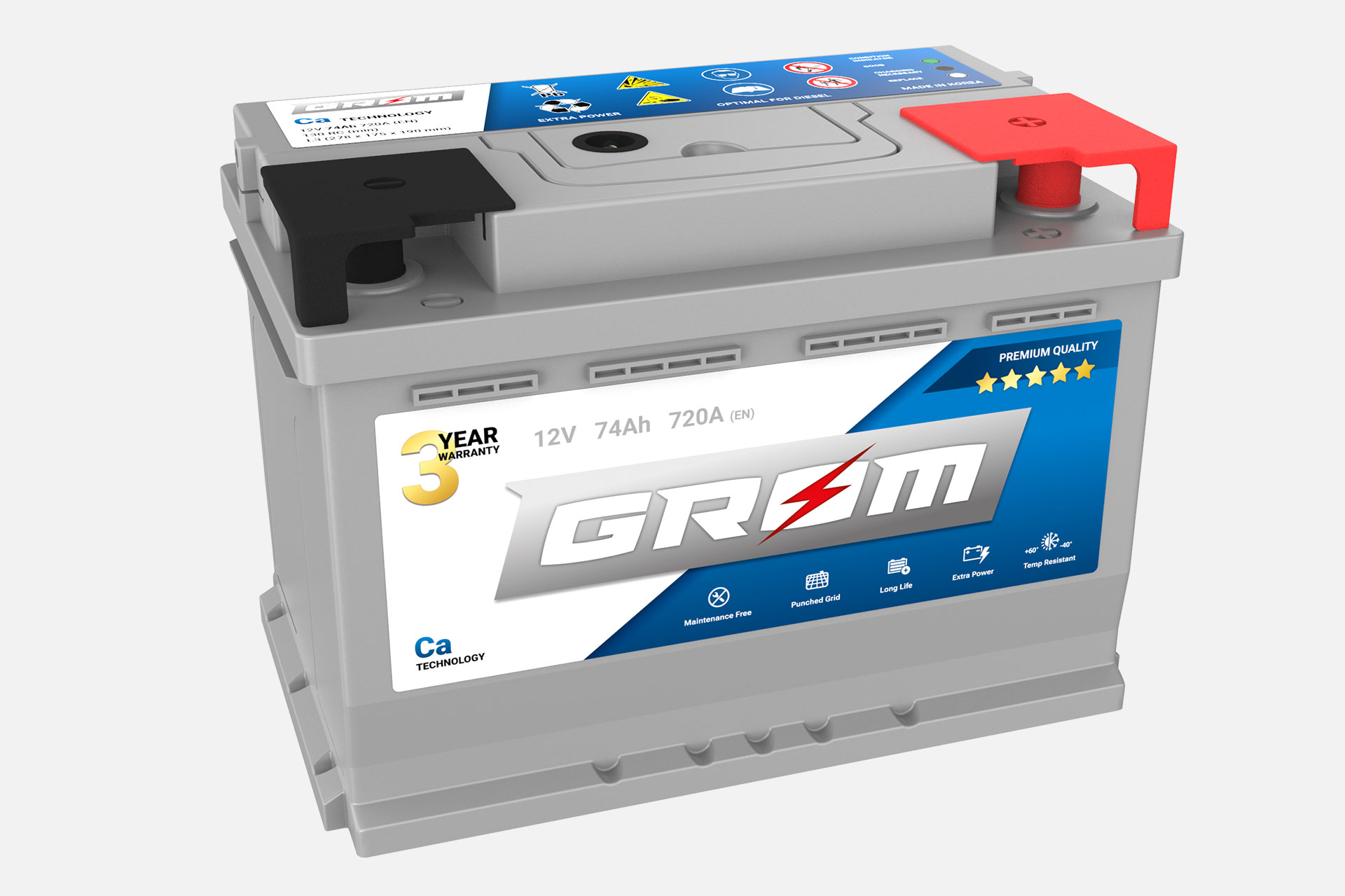
Grom Premium
Basic premium product – a guarantee of reliability for at least three years. The most important features highlighted in the icons.
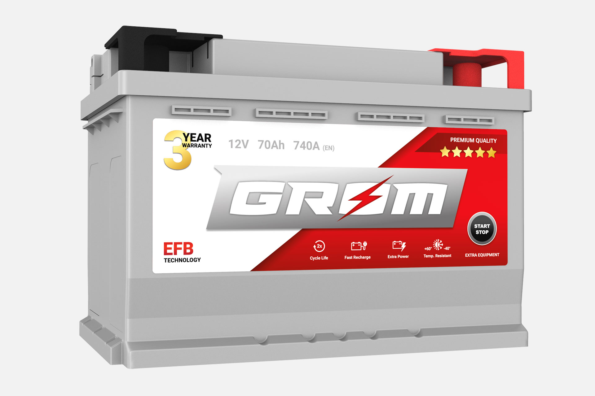
Grom EFB
A product for cars with a start-stop system.
Highlighted features such as increased cranking power, support for the start-stop system, support for additional equipment.
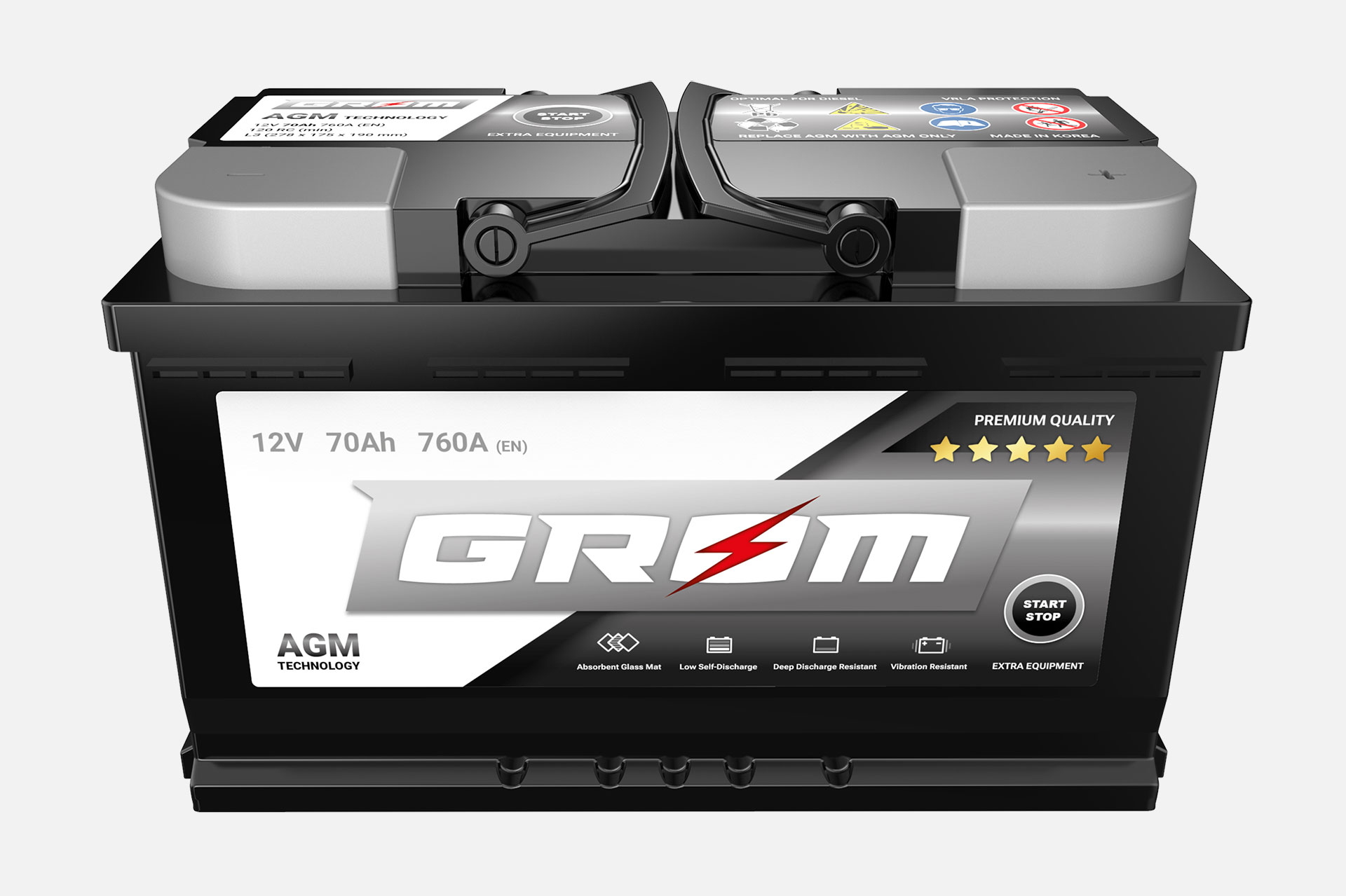
Grom AGM
A product of the highest segment, which is emphasised by a metallic label.